
mentalfloss.com
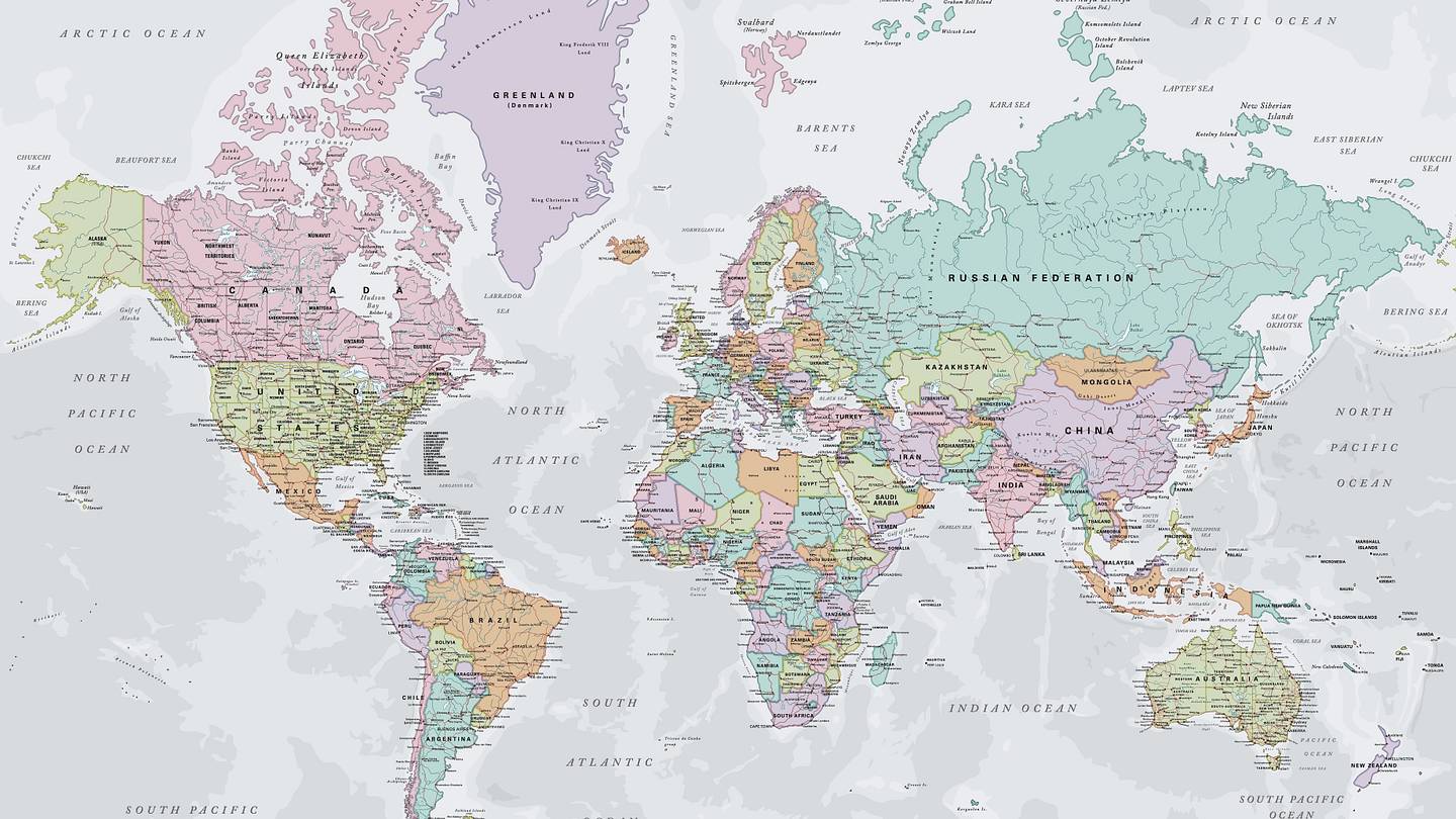
5 Things the Mercator Map Gets Wrong
The Mercator map, which most of us grew up with, makes Africa look smaller and Greenland much larger than they are—but that's just the tip of the iceberg.
If the page stays blank, open it in a new tab. Your Weird rating still works from the top bar.
Open source